As I discussed in my last post, we believe that monitoring, like many other DevOps tools, needs to be adopted by other teams (i.e. developers, product managers, support, QA etc.) outside Operations. The trouble is many of the popular monitoring tools today were written by Operations guys for other Operations guys and don’t make it easy for other teams to adopt. Here are our top 7 ideas on what will make your monitoring tool more popular outside your team, so that everyone in your organization can get the visibility and insight they need to build a better service together.
1. Make it incredibly easy to get metrics In
Nagios scripts are awesome for Operations people to quickly write checks to monitoring the services they’re running. They’re simple, can be written in any language as long as they output a simple STDOUT string format. The trouble is getting the check deployed to the servers that require it and getting the new check added to the monitoring system can involve multiple steps and a PHD in the monitoring tool.
Many Operations teams provide Puppet or Chef modules that make it easy for developers to add new checks to the system. This automates the numerous steps involved to add new checks and ensures that they’re deployed in a consistent manner across your environment. This is a good start but even then, developers usually want something even simpler.
Enter Graphite, and StatsD. This allows developers to stream metrics via UDP (so the requests are non-blocking and don’t slow down the performance of the application) without any configuration. The developer just sends the metrics back from their application (usually via a StatsD library) or 100’s of Open-Source tools like CollectD, and the metrics are automatically stored and ready to be used on dashboards/graphs as needed.
Another way to make it easy to get metrics in is to mandate that every service a developer creates supports an endpoint like SE4, created by our friends at Beamly. This allows developers to create simple JSON endpoints that a simple Nagios script on each server can use to suck in all the metrics and status codes they expose at the endpoint.
This ensures other teams outside Operations can have ownership over what metrics they think are important and need to be collected, and gets rid of them having to create a JIRA ticket with Operations every time they want to monitor a new service they’ve created. Without making it easy for other teams to get the metrics they care about into your monitoring system it will be hard work convincing them to use the monitoring system in the first place and all the next ideas won’t be of much value.
2. Make it easy to create beautiful dashboards
If you make it incredibly easy for users to get their metrics in, you’ll soon have so many metrics coming in you may quickly hit scalability issues with your monitoring servers! (a topic for another blog). Assuming all is well however, its important to let the users select the metrics they care about and visualize them in a way that makes sense to them so they can get value out of the metrics they’re sending back.
I emphasize “beautiful” dashboards because as Operations people we tend to have a low bar when it comes to UI design (if you don’t believe me, just look at most of the Operations/Monitoring tools out there!) which can turn off other teams like developers from actually adopting the tool. Its also important that the dashboards can easily be created quickly in minutes through the UI and doesn’t require a JIRA ticket to write some code to update the dashboards (as we’ve seen at some organizations) otherwise users will quickly lose interest waiting for the dashboards to reflect the metrics they care about.
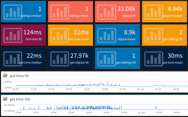
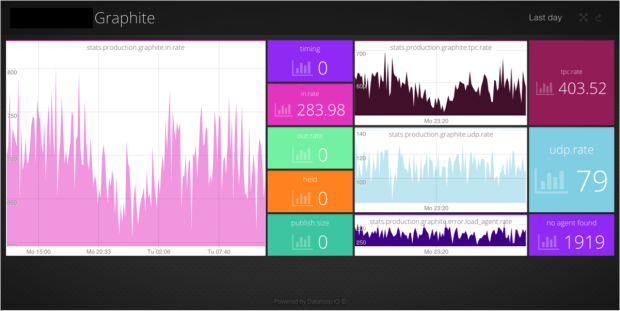
Fortunately some really s**t-hot developers have stepped in to create some Open-Source dashboard/analysis tools that allow users to quickly configure and visualize the metrics they care about on dashboards that can be shown around the office. Although there’s loads out there, we’re big fans of Grafana, which can take Graphite data and visualize them on nice dashboards for analysis. If you do want to code something up, we’re also big fans of the Open-Source dashboard framework Dashing, however it requires coding which prevents less technical users (i.e. QA or Product Managers) from setting up their own dashboards without raising a JIRA ticket.

3. Make it easy to alert off metrics
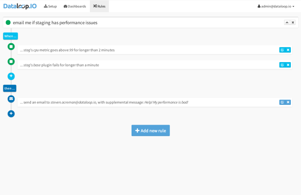
Its not really a monitoring system if you can’t get notified of issues with your service! If you decide to go down the Graphite/StatsD route to make it easy for developers to send in the metrics they care about, then you also need a way for them to set up alerts where needed so they can get notified when things go AWOL. Also allowing developers to setup (and receive) their own alerts is a great way to reduce spammy alerts. By getting the people who create the metrics and alert thresholds to also feel the pain, you’ll see a dramatic reduction in the number of false alerts that go unrectified for months on end!
The trouble is, whereas Nagios has built in alerting, Graphite and StatsD do not. This is actually a really hard problem to solve (as we discovered writing our own solution for Outlyer as it involves processing 1000’s of metrics every second and matching pre-configured rules/thresholds in real time. One Open-Source tool that has appeared recently to solve this problem is Riemann.io. Although technically brilliant, it is a complex tool to learn and develop (you’ll need to learn Clojure) and will need to be wrapped up in a simple UI for less technical users to adopt it and create the alert rules they want.
However (shameless plug), we’ve actually solved this problem for Outlyer so feel free to check it out!

4. Wrap it up in a simple, beautiful, self-service UI
Now that you have the 3 main components of your simple to use monitoring system, you want to bring it all together into a simple to use, beautiful (nice to look at), UI that users can log in to and use day to day as a self-service solution in their teams. One thing people hate is having to log into lots of different URLs. With the Open-Source solutions above they’d be one URL for Nagios, another for Graphite or Grafana, and another for Riemann. This is where creating a simple portal that can pull in the main features from each in a nice UI can make a big difference. It gives users one place to log in to every day, and with a good design, can provide a consistent user experience for users to setup the metrics, dashboards and alerts.
Unfortunately we’re not currently aware of any Open-Source tool that’s written to bring everything into one place. Many of the larger organizations we’ve spoken to (like Netflix or Twitter) have dedicated developer teams developing their own internal custom monitoring tools that provide a single place for users to log into everyday. However most organizations can’t afford to invest that type of resource into developing their own custom monitoring tool, so for now you may need to look at one of the SaaS monitoring tools that provide nice UIs and can bring all your metrics, dashboards and alerts into one place.

5. If they won’t come to you, go to them
Even with the most beautiful of UIs, don’t expect all your users to adopt your monitoring solution, no matter how good it is. As we’ve stated before, Operations team are collecting a gold mine of real-time data about the services their businesses rely on to generate revenue. It could be business KPIs (signups, users online, revenue, uptime) or Operational metrics (average load, capacity available, number of transactions, hosting costs etc.). When its so easy to get metrics in, we see a lot of value with putting your business KPIs alongside your Operational Metrics to see correlations and build reports to get exposure for your team with business stakeholders like management.
In fact we did this at our last company, and it was incredibly valuable to get management to see and understand the issues we were facing in Operations running our online service. However even with plasma screen dashboards showing the metrics we cared about around the office to developers and management, we really needed a way to put the key metrics we cared about into the place they worked - their Inbox. So we wrote a brittle Ruby script that collected all the key metrics we wanted to share with management into a weekly email report, which would be discussed in our management meeting on Mondays.
It was extremely effective, and put issues we’d raised previously, in the forefront of managements mind and more importantly, got them to take action on some of the issues we cared about. If you want to get adoption by other users, and get buy in from management, we found getting key metrics into a weekly scheduled email that got sent out to key stakeholders was extremely effective. The key lesson here though is to think about where your users currently work and make the information you’re collecting in your monitoring solution accessible to them without forcing them to change behavior. That way you get what you want (action on key issues you care about) and they get what they want (not another tool to log into to see how the service is performing).
6. Make it easy to share
In a similar light, if you want to share some of the graphs you’ve created with other people not using your monitoring tool, and even drive interest to using it (virality) there’s nothing simpler than adding a sharing URL to your dashboards and graphs. Graphite provides a simple render API that allows you to create a URL of a graph and embed it into emails and other web pages for easy sharing. Not only does this make it easy to share, if the dashboards and graphs are of interest to other users, they may ask how to create their own and request access to the monitoring tool so they too can setup new dashboards and graphs for themselves.

7. Use folders & groups extensively
If you have a larger organization, you’ll quickly start getting lot of metrics coming back, dashboards getting setup and alert rules too. This can quickly overwhelm users who don’t need to see everything with metrics (usually with abstract names) coming from other parts of the service they don’t care about, or dashboards and alerts setup for different teams, creating a massive list for them to scroll through.
The simplest way to avoid this is to use folder groupings, so metrics/dashboards/alerts are grouped in a way that different users/teams can easily find their metrics and dashboards. This is easy enough to do in Graphite. However if you’re using your own custom UI like we recommended (or a SaaS tool like ours) then you can take it up a notch by adding user groups too, so that as users move between teams they can be added and removed from groups to get instant access to the monitoring data they need without being overwhelmed by everyone else’s. This doesn’t mean not allowing users to browse all the metrics/dashboards and alerts in your monitoring system, we’re all about transparency too, just providing that initial user experience where they see what they need too and can uncover everyone else’s monitoring data later on if needed.
Obviously we are incorporating all of these ideas into our new monitoring tool Outlyer as we think its incredibly important to provide a monitoring tool not just for Operations, but the teams that work alongside them. There are approximately 20 large companies on Outlyer now and we’re expanding that daily to get more feedback from companies running cloud services before we launch online towards the end of this year. If you are running an online service then get in touch and I’ll get you onto the free beta.