Since we make the collection of data super simple with self-service and open source standards, it means our users continue sending us more and more of the stuff. We support monitoring all layers of your service, including host, application and business metrics. While you need as much information as possible about how your online service is performing, you can soon end up drowning in data, making it hard to know what you have, let alone gain any valuable insights.
As your service and monitoring evolves it can be difficult to keep track of exactly what you are collecting. You might have StatsD running and collecting metrics for one part of the system, and a bunch of Prometheus exports and Nagios plugins monitoring another part. There is also a high probability that the people who set some of this up are no longer with the organization.
What happens when you need to monitor a new service that depends on existing services? Are those dependencies already monitored? Are they returning the stats you require? A lot of these questions can be answered with documentation, but as we all know this often gets neglected, especially if it’s not user facing. Monitoring evolves and the metrics you are collecting can change.
It has always been a goal at Outlyer to make data as discoverable as possible. What do I mean by this?
Dot (.) Separated Paths
To make the data discoverable, we originally opted for the Graphite approach, by rendering a tree of metrics based on dot separated metric paths (e.g., us.west.web.system.cpu.0.idle)
Having a tree allowed users to generate metrics in a hierarchical structure, making them easy to browse and visualize what already existed. Although there is some flexibility in these paths using wildcards, it does require some pre-planning on the structure of your metrics, and even then it is possible to get into a mess.
Dimensions
These limitations, coupled with the introduction of things like Prometheus and Metrics 2.0, started a trend towards more self-describing metrics. The idea is to keep the metric path (or name) concise, for example ‘system.cpu’. You would then describe the metric using tags (or dimensions), like ‘region=us-west’ or ‘host=webn1’. Having data structured this way makes things a lot simpler (for the user) when trying to perform complex analytic queries on the data.
The problems with this structure comes with scaling and retaining discoverability.
As each of these tags is in effect another time series, this can lead to an exponential growth in the number of index entries. Also, now that the focus is around tags, it requires both the tag varieties and metrics under selected tags to be browsable.
Introducing the Metrics Browser
If you have read previous posts, you may know that we store our time-series data in an open source database called DalmatinerDB. This a highly scalable database built in Erlang on top of Riak core. Dalmatiner comes with a very powerful query language, supporting many different aggregation functions. We also worked with the maintainer to build support for storing dimensional data. Dimensions are supported via a set of highly performant indexes in Postgres.
We have been running this database and using dimensions in production for well over a year now. Until this point the power has largely been hidden from the user, as we had previously only supported simple metric- and host-based queries.
We could have simply released an interface to the query language and allowed users to write raw queries directly against their data. While this would have certainly been quicker, it would have also required the users learning the query language and wouldn’t have made for the best user experience.
Instead, we spent several months developing a query builder in the UI, which we are calling the Metrics Browser. It makes it intuitive to construct complex analytical queries on your data, while also making the data discoverable.
The query
When first entering the Metrics Browser, you are greeted with a large display panel for the graph, below which is a panel for constructing your query (or set of queries).
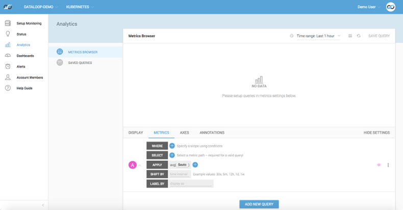
To construct a query we first ask you to define one or more WHERE clauses. Much like a SQL WHERE clause these act as a filter on the data in your account. It is simply a case of selecting some Key-Value pairs from pre-populated drop downs.
A simple example would be to filter for a particular host. In the first (Key) dropdown you would select ‘hostname’, then in the second (Value) dropdown you would select a host from the list. This list is pre-populated with your list of Agents. Then you are done. With a valid WHERE clause selected we can filter all your data down to a much more manageable set.
The second field, SELECT, allows you to select a specific metric from the filtered list. This is done be selecting one part of the path at a time, which makes is super simple to browse the data. If you were to select ‘base’ in the first dropdown for your Select, the second dropdown would only display ‘base’ metrics. As you can see, it is really easy to traverse your metric tree.
The next field, APPLY, is the fun one. Here you can apply a series of aggregation functions to your selected metrics. You can even apply some of the functions between series. This provides a lot of power. The function selector displays a categorized list of available functions, as well as a short description for each.
As soon as you have completed these fields, the results of your query will be rendered in the graph panels.
There are also other tabs, which will allow you to configure the widget, like Axis, Units and Annotations. They are fairly self explanatory, so I invite you to play around with them.
What use is that?
Let’s walk though a real life example. We noticed a prolonged spike in the get latency against our time-series database. Here you will see measurements for all the nodes in the cluster over the last 24 hours. Notice the spike starting at 18.50.
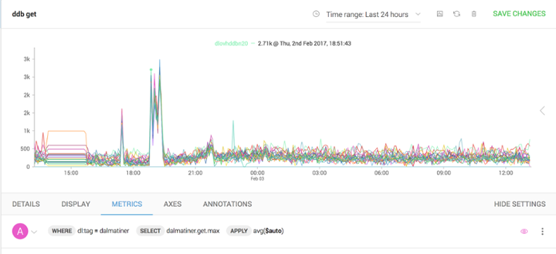
Let’s zoom in to the get a better view, by clicking and dragging across the affected region. We can see it’s definitely something that’s affecting all nodes.
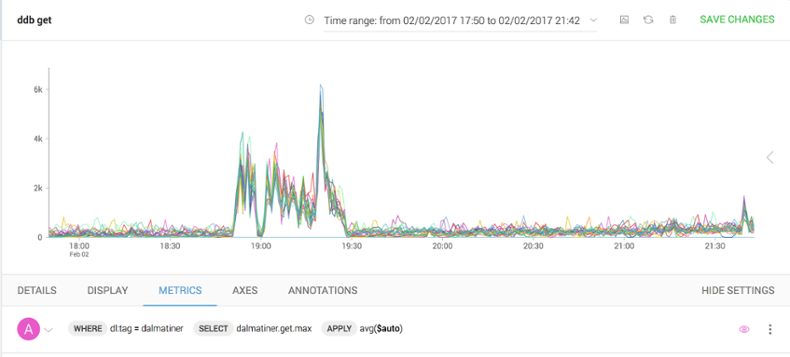
To make things even clearer, let’s combine all these measurements into a single aggregated series. We do that by applying a series combine function in the APPLY block of the query.
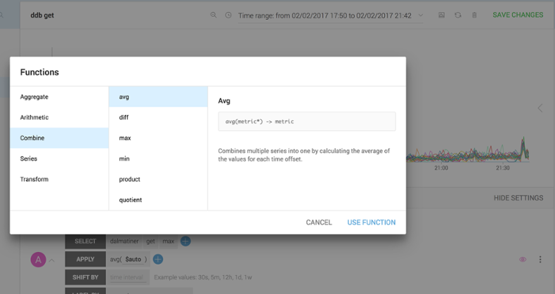
This will then render a single series for us to use. Much cleaner.
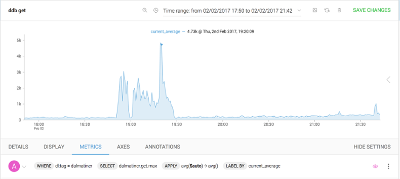
Now that we are down to a single series, let’s compare it with other measurements to see if there is a correlation—perhaps it’s seasonal and this blip happens every day. This is simple to do. In the query window we can duplicate our original query, then in the SHIFT BY field shift the new query by 24 hours.
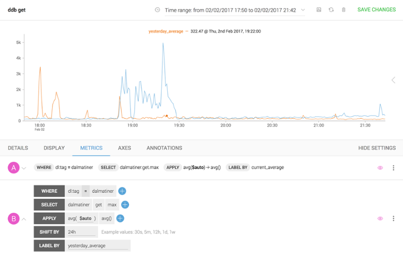
We can see that it is not a seasonal spike, but that it is limited to the last 24 hours.
The next thing we can do is to turn on annotation and display the ‘deployments’ feed. This is done by selecting the feed in the Annotations tab.
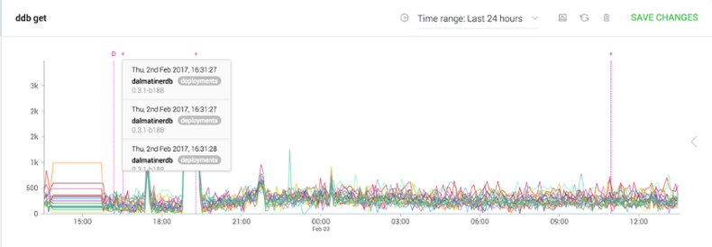
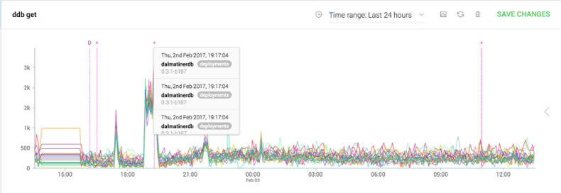
As we can see there was a code deployment at 16:31 of build ‘0.3.1-b188’. This deployment proved to the cause of the issue, although it only manifested several hours later.
As you can see, this graph also shows the annotation for the fix being deployed, which in this case was to revert to the previous build.
That was just a basic example of how you can use the Metric Browser to troubleshoot issues. There are many more instances where you’ll find analytics in this form very useful. Pop into our support Slack with any questions or fun use cases. And, of course, if you have not yet tried us, now is the perfect opportunity (it’s free and full-featured for 14 days).