Code Level Metrics
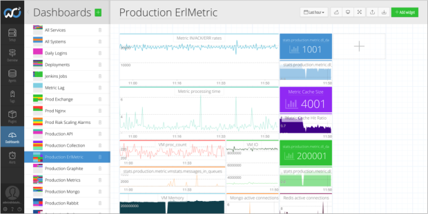
Developers are primarily interested in seeing how their code is performing, whether that’s on their laptop, production, or anything in-between. Seeing code metrics alongside system resources and business metrics is extremely useful when you’re building and operating an online service.
Outlyer supports ‘StatsD’ metrics which means developers can add an open source library and then instrument their code by adding lines in a similar way they would add logging. This is extremely lightweight, with the metric data being sent to Outlyer over UDP, so there’s no noticeable performance penalty.
The most common metrics returned are usually counters and gauges. These can be used to track things like the performance of an API, the throughput of a service, error rates and even how often a feature has been used. Product managers find it hard to argue with graphs.
With access to more data, a developer should make better decisions, or at least that’s the theory. The cool thing about StatsD compared to APM tools like New Relic and AppDynamics is that you get to specify exactly which metrics to watch. There aren’t really any limits; if you can get what you want to watch into a variable then it can be tracked and graphed. Used alongside APM you get an incredible level of insight into what’s happening in your app.
|
|
|
|
| API Performance | Worker Capacity | Worker Throughput |
Unlike the operations dashboards that only get looked at when something is broken, developer dashboards are typically used while features are being built. Having sat with our own developers I know how great this stuff is for optimising code and finding the root cause of issues.
The downside is that developers are always so busy getting the next feature out, they can end up making haphazard dashboards. Constantly evolving code means constantly evolving StatsD paths and regular housekeeping on the important dashboards.
Micro Services
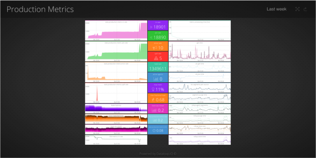
Looking at the performance of individual pieces of code only gets you so far in complex environments. You might have dozens of services that all communicate as part of a complicated distributed system. It’s pretty hard to work in this kind of environment without good monitoring.
We use a micro services architecture at Outlyer and have an overall status dashboard showing health for each service. There’s also a dashboard per service that contains the key metrics we need to look at. An good example of one of our services is our Graphite endpoint that exposes a UDP port and converts those packets into messages.
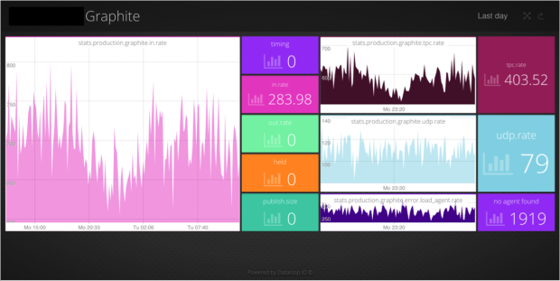
These dashboards tend to be a mix of StatsD metrics alongside operational metrics coming from Nagios plugins. It’s often hard to know exactly what to look at for each service so these tend to evolve over time.
Infrastructure Metrics
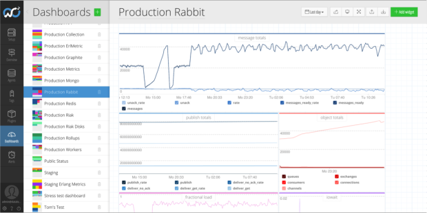
Developers increasingly rely on an assortment of services as we saw in the previous blog about Ops Dashboards. In the old days a developer might investigate an issue and struggle to find the cause. It’s tempting at that stage to start raising tickets for Ops to investigate. You can save a lot of time by simply pulling up dashboards for key services to see if there is anything wrong. Breaking down silos and reducing handoffs is the lifeblood of DevOps principles.
Containers and VM’s
Docker is the new cool kid on the block so we’re starting to see more dashboards created to track number of running containers on hosts as well as resource utilisation and capacity metrics to provide an overview. We don’t have any customers using Mesos or Kubernetes yet but I can certainly imagine we could create some cool dashboards to track realtime container numbers and health per micro service.
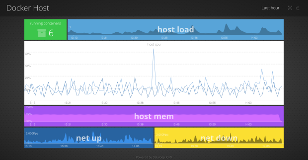
We did a blog on how to monitor Docker a while ago which shows how we capture resource metrics. The method of capturing code level metrics remains unchanged in containerised environments so from a dashboard perspective there’s no real difference.
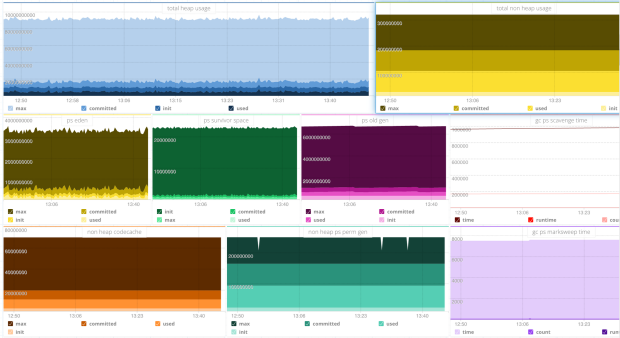
For those running Java we also see a lot of dashboards tracking JVM metrics. It’s useful to see if performance complaints line up with garbage collections and keep a track on memory usage.
Summary
In modern micro-service based environments it would be almost impossible to build and operate a successful online service without the kind of metrics shown above. A lot of developers that we have on-boarded were already using StatsD metrics with either Graphite or InfluxDB / Grafana.
Traditionally operations metrics were separated from the monitoring tools used by developers. It’s good to see dashboards being shared between teams. In particular the breaking down of silos between Dev and Ops in terms of how far a developer can now troubleshoot from the code all the way down into infrastructure and services, without needing to wait on anyone else for help. It’s also a two way street with Ops often creating alerts on important code level metrics.
In the future we plan to add more analytics features for developers. Adoption is still our main focus so we’re also building out an account model very similar to Github to encourage collaboration between teams.
Series Posts:
Dashboard Examples: Background


