At Outlyer we are continually working hard to improve the product. The objective is not to build a great monitoring tool, but to help you all get things done; Making users lives better.
A great product is one which solves a problem and is intuitive to use. We made our first step towards this with V2, and now we are looking to take it even further. We are focusing a lot of effort on improving the end user experience of Outlyer.
How?
To facilitate these improvements, we are making some updates in a couple of areas. We are making changes to the aesthetics of the application, which involves an overhaul of the styling. Aesthetics is more than making the UI prettier - of course, we will be doing that too - it’s also about making things clear, simple, consistent and straightforward.
The second aspect is improving the application’s usability, which means:
- Unimpeded workflows: the UI should NOT get in the way of the task you are trying to complete.
- Simple navigation: you should be able to get to where you want to go as quickly as possible. A further aspect of this is a clear mental map of our application, so it’s clear where you need to go.
- Guidance when lost or unsure: Subtle cues, unambiguous terminology and access to help. It’s hard to cater to every use case or eventuality, but there should always be a way forward.

What’s Changing?
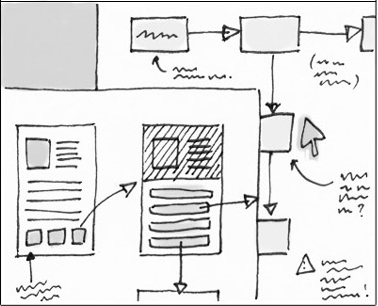
We have a plan to address these issues (or at least how to start). It will be an iterative process of improvement, testing then further improvement.
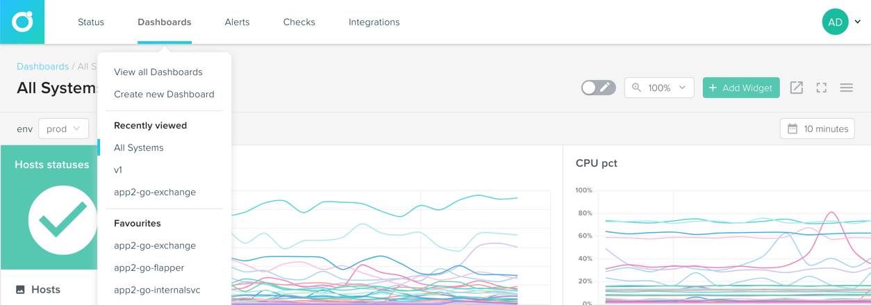
The first phase of these improvements will be an initial update to styling and a new horizontal primary navigation. I won’t go into the details of why the switch from vertical to horizontal (that’s a complete post on its own), but we found the vertical navigation wasn’t the most intuitive, as well as well as not being a great fit for other UI changes we plan to make in the near future.
These changes will start to roll out in the coming days. It will take several iterations to get it perfect and consistent. The shift in navigation will take some time to adjust to, but it should start to feel natural pretty quickly.
I would appreciate any feedback, concerns or queries. Our objective is to make a product you love and if we aren’t achieving that we need to feedback to adjust.

What’s Next?
We will continue iterating on the user experience of the app. There is a lot to cover, and we are still moving full steam ahead with feature development, so these improvements won’t be made overnight.
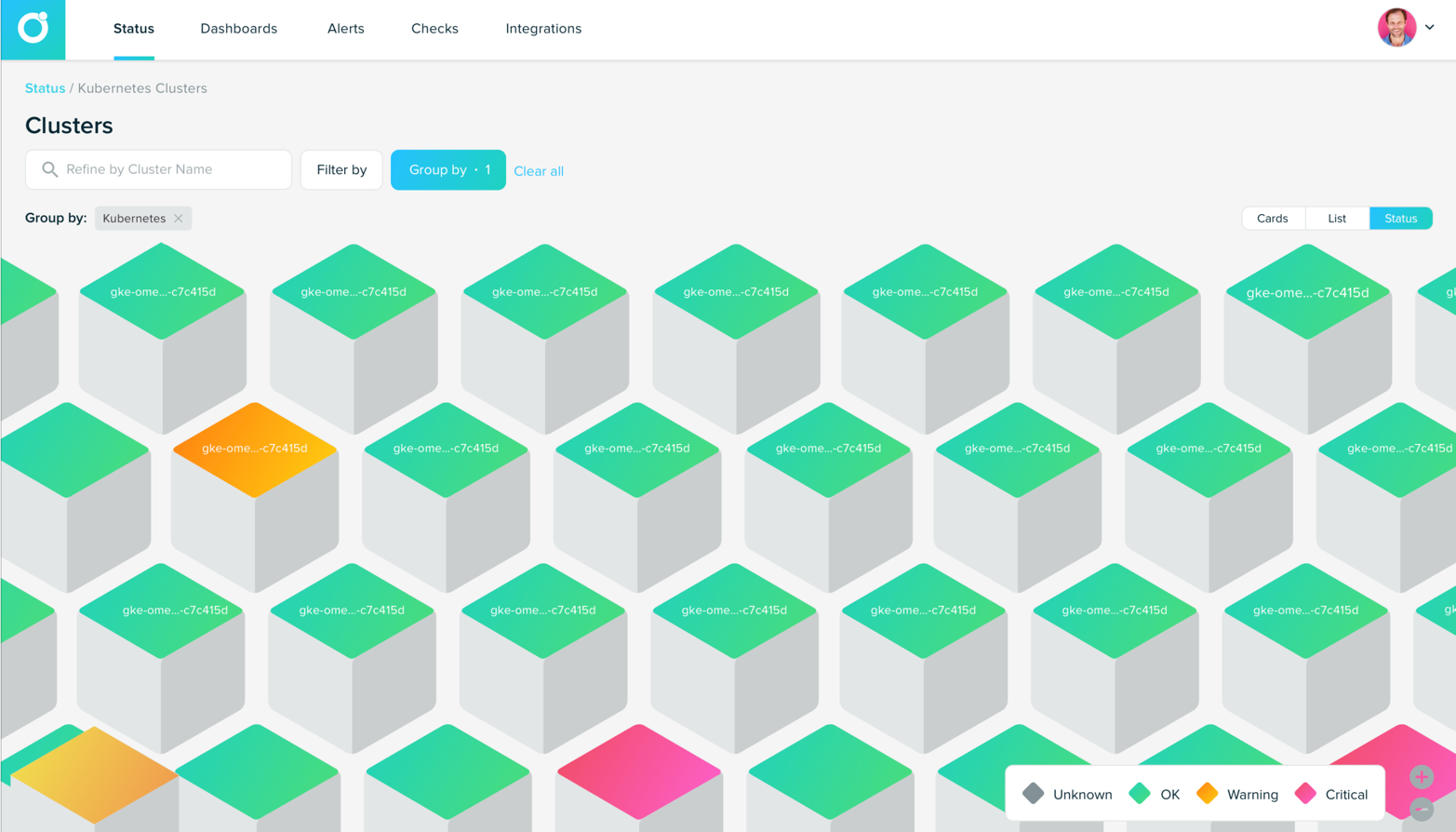
Over the coming months, the new styling will be rolled out across the application. There will be new host status visualisations being release. So you will be able to see what you have, where it’s broken and why. Improved user journeys through the app making it simpler to solve the current task you are working on.
There are exciting times ahead and amazing results at the end of it.
