To set some context I’ve been working with developers for the past 14 years inside software companies, usually on the operations side of the fence. I’ve watched first hand how every one of those companies has tried to transition from creating on-premise software to running a SaaS service.
Every time it has been a total nightmare. I would actually classify it as torture. Companies born in the cloud have it easier, but SaaS is still several magnitudes harder than on-premise to be successful at. Back when I first started my career we used to get emails sent round about Sales Guys X who had sold a $Y million deal and who knows if that software ever actually got setup or run in production. Probably not, IT projects are known to fail, or were back then. Nowadays someone enters an email address and a password, signs into your service and within 20 seconds has decided if they want to actually spend any time on it or not. Often they log off and never return.
Since escaping the world of comfortable and gainful employment I’ve started my own SaaS startup. We don’t have any of the baggage that enterprises have, yet it’s still insanely hard. We’ve been absolutely prolific in our discussions with other online services, not only about monitoring, but about everything related to running an online service. At this point, if you’re running a large online service in London and you haven’t had myself and David turn up to chat about monitoring you’re in the minority. We’ve talked to hundreds of companies, we run the worlds largest DevOps meetup group, DevOps Exchange, and we’re starting to invade San Francisco. Everyone we speak to is having the same old issues.
I’ve wandered around a fair number of offices and the definition of what a dashboard is varies wildly. I’ll list a few of the types I’ve noticed so we can further define which one I’m concentrating on in this blog. In future I’ll probably blog on the rest too.
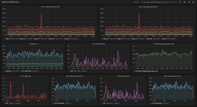
Analytics Dashboards
Used by a dev or ops person usually to help troubleshoot performance issues with the service. Often found on their 2nd monitor, or 3rd, or 4th depending on how nice they have been to IT. Example things you might find here are New Relic for Devs, Graphite / Grafana for Ops and a multitude of other tools like ELK (Kibana is exceptionally pretty and useful). Whenever we talk to anyone they immediately assume we’re talking about this type of dashboard. You’ll use this type of dashboard to correlate, aggregate, chain mathematical functions and try to coerce streams of data into discernible patterns with the hope you’ll uncover something that needs fixing. A lot of APM tools are getting really good at automating a lot of that stuff.
NOC Dashboards
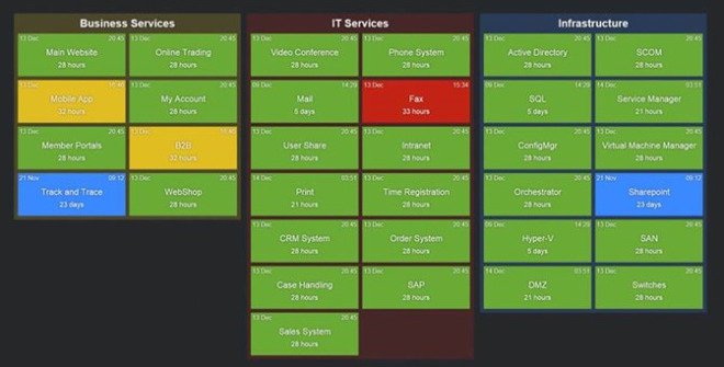
I’m breaking these out because I generally see them being used as a kind of shared 2nd screen analytics dashboard. Their audience is generally a group of highly technical people sitting very close to them. Mostly these run <insert on-premise monitoring tool of choice here>. Nagios web host groups status pages, or in some cases something like Solarwinds. Generally these get rotated with some APM dashboards and even the live website to see if its alive. One very large news organisation we visit has their website up and automated clicking throughs to news articles. Any big 404’s are quite noticeable.
Team Dashboards
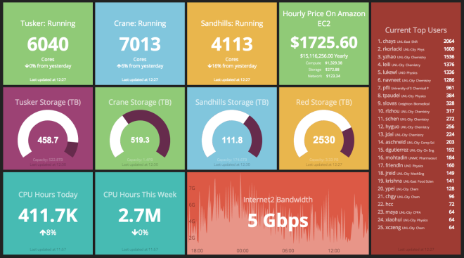
Most of the companies we talk to are trying to do ‘DevOps’. Often you’ll get various teams sitting with each other and there’s generally a consensus among everyone we speak to that they want to take a more Micro-Services approach to running their service. In this setup you often get what I call Team Dashboards. Usually rotating browser tabs showing things the that team want to see to help them run a better online service. We see a lot of Dashing.js, and a bunch of different tools that give an idea of number of users online, or marketing type data. It’s often one of the Devs on the team that knocks something up and it stays that way for months.
Public Dashboards
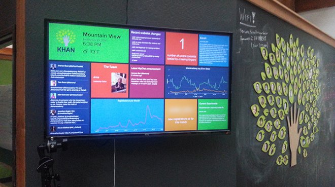
These are the dashboards on TV screens in public places. You might have one in the kitchen or dotted around the office. These are generally very simplified, quite sanitised dashboards that rarely change.
This blog post is about the latter two types of dashboards; the Team and the Public ones. While analytics is certainly very valuable, and companies spend a considerable amount of money on tooling to help with this, in my experience this isn’t actually the biggest problem. You need good analytics, I’ll do a blog post about it some other time, right now it’s at least number 2 in the list of things I think are important for the majority of SaaS companies I talk to.
So what’s the biggest problem?
It’s people.
At a SaaS company you need to be working on the right thing. If you end up working on the wrong thing you may as well have gone on vacation. In fact, going on vacation and doing no work at all would have been better, since that would have resulted in less wrong code to support in production.
It is crazy easy to get detached from reality in SaaS. I’ve seen situations where teams of people have been patted on the back for successful feature deliveries when the service itself is dreadful. We’re talking 40 seconds to login dreadful. Or other cases where so much process and red tape is put around deployments, yet when you look at the number of users it’s less than a handful. People have experiences, perceptions and a lot of assumption they carry around with them. Often these things get in the way, especially when your goal is to move fast and do the important things like actually making users happy.
Then you have different roles within a team. The developers are head down playing with technology and solving problems. The ops guys are trying to work out ways to keep the service stable and bullet proof by doing things like removing single points of failure etc. Ops are rewarded for uptime, devs are rewarded for features. Unfortunately product management usually only care about features too. You end up with this weird divide and as time moves on various sides entrench and it’s really hard to undo.
You also have the opinion driven discussions. Everyone has an opinion, some are even valid. It’s extremely frustrating to be in a team where opinions differ on important things. You can end up in an extremely toxic state. Nobody ever wants to be wrong about something so you end up avoiding topics or going with the status quo, no matter how silly.
In all of these cases the solution is dashboards. But not the type I sometimes see when I wander round offices or referred to in the Dilbert strip below. If you have a dashboard that’s black, with tiny size 8 font and graphs that nobody even knows the meaning of then you might as well turn off the TV.
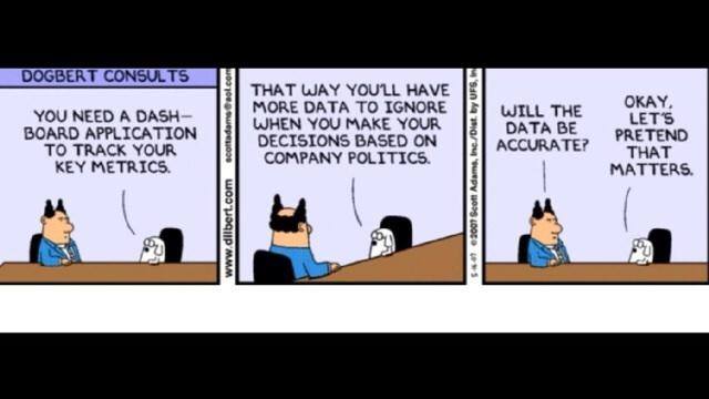
The sort of dashboards I’m talking about are ones that change human behaviour. They exist, I have seen them work many times and they are awesome.
If your team and public dashboards aren’t designed to change human behaviour, if they aren’t simple and relevant to your audience and if they aren’t being updated regularly to help shape the direction of your SaaS service, then my advice is to put the TV screens up for sale on Ebay and use the money for something else.
Operations often do not realise the power of the real time metrics coming out of production systems. You can literally control the product roadmap
A Real-Life Example
I’ll give an example of how dashboards have changed a previous team.
At one company we suffered months of service neglect. The service was unstable, it was slow and quite frankly it was embarrassing to be associated with. Development were off building features, product management had zero interest in the service, all they cared about were their own lists. As an Ops team we had to beg for time to be spent on critical issues. Management reports from engineering were always glowing as they focussed on delivery dates and other non tangible things. Since the on-premise business was keeping things afloat the company wasn’t about to die by releasing a rubbish service. But you can probably imagine the levels of frustration started to rise.
One day we wrote some brittle Ruby scripts that polled various services. The collated the metrics into a simple database and we automated some email reports and built a dashboard showing key service metrics. We pinpointed issues that we wanted to show people. Things like the login times, how long it would take to search for certain keywords in the app, and how many users were actually using the service, along with costs and other interesting facts. We sent out the link to the dashboard at 9am on Monday morning, before the weekly management call.
Within 2 weeks most problems were addressed. It is very difficult to combat data, especially when it is laid out in an easy to understand way. Within 2 months we had a dedicated development team, a new development process and a system to prioritise service issues alongside features. The most important thing was the change in culture. Everyone had the same goal, everyone was rewarded for common metrics and that resulted in a much more fun atmosphere.
Other Real-Life Examples
Before this blog turns into one of those touchy feely self help articles it’s probably best to show a few examples. I’ll add more over time, as I get approval from their creators. Here are some starters:
1. Monitoring Deployments
We moved to a new code deployment model that involves each engineer releasing their own code in an automated way between environments, all the way to production. Before we shifted to devolving the responsibility of releases down to each engineer I was having to spend a lot of time chasing when things would be ready, coordinating deployments, guessing how much risk was involved and then testing code I had no clue about. Luckily, we started to get more US customers so I started travelling and handed all of that over to Colin who agreed it was a very silly thing to be doing. To ensure this was being followed and to help the team adapt we show this dashboard.
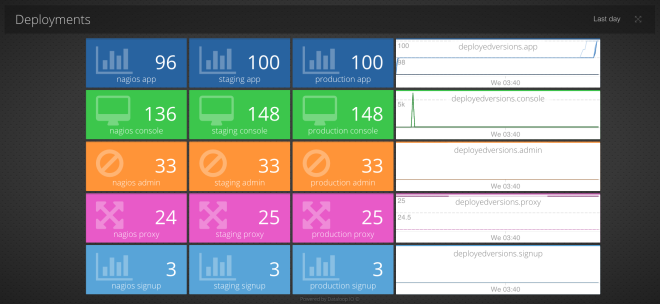
During a change it is best to over communicate. This dashboard really helped us get a handle on which build was in which environment and how far apart each was from each other. It also charts the number of releases per day which has increased significantly. This dashboard took 5 minutes to create and really helped sanity check the process was being followed during the first few weeks until human behaviour was changed for good.
We even setup an alert rule so if Staging gets more than 10 releases ahead of Production, the developers are notified its probably time to do a new production release before things get too out of sync, and the release risk gets too high.
2. Broken Builds Stop the Floor
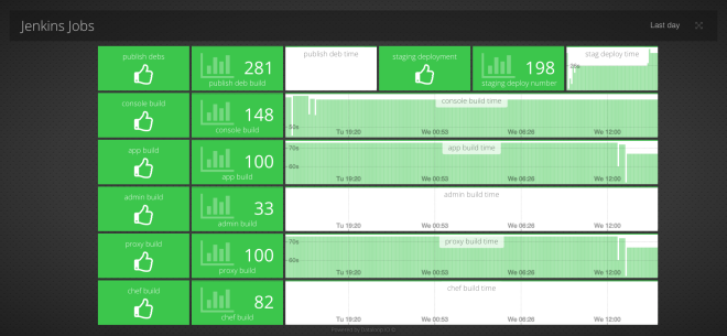
We use Jenkins, and specifically Jenkins with the Green Balls plugin. Even so, the status indicators are a bit small to throw up on a TV screen. What we really wanted to ensure was that nobody was checking in code that would break the build and deploy pipelines. It’s far easier to correct those issues immediately than it is to wait and find out some time later. At that point you may have a bunch of commits that came after and it becomes a horrible mess. If you can’t deploy code then you shouldn’t be writing code, everyone should be reassigned to fixing the pipeline if it breaks really horribly (usually it’s just the person who broke it who needs to jump in and fix it though). After throwing this dashboard up I’m not aware of a single time someone has come to deploy and things have been broken.
3. Establishing Credibility & Building Relationships
Typically when work is agreed, people go off and no one has any visibility into the progress of that work until they get an email or talk at the next meeting. Dashboards give a real-time view on what’s happening right now, allowing different teams to see the progress of that work in between status updates. Being kept in the loop with such a high level of visibility is great for building relationships. We’ve seen countless examples of this working within an organisation.
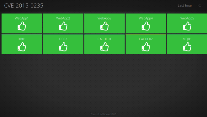
One of our customers, DevOps Guys, provides DevOps consultancy to various online services. They wrote this blog on how they used our dashboards to provide visibility to one of their customers while patching a critical security vulnerability. In minutes, they had a dashboard they could share with the client, who could then see in real-time how many of their boxes were fixed.
A lot of the work I’ve done in the past has all been about building credibility. Giving people extra visibility into how you do stuff can make you look competent and professional. Once you’ve established credibility, people are far more willing to listen and accept the the things you say, and ultimately this leads to positive change.
4. All Hands on Deck!
This Star Trek dashboard is still the coolest dashboard I’ve ever seen. It doesn’t change behaviour (probably), but it is cool, and probably makes it harder for the team to ignore critical issues on the service, like they could an email, ensuring issues get attended to and resolved faster!
Summary
It’s not up to 1 person to decide what to show. It should be a collaborative group effort where individuals can self service these dashboards form a wealth of production data within seconds.
If you are running an online service and aren’t using data to drive how it is run then you are missing out. If you have any tales about how you’ve used dashboards to change behaviour within your group we’d love to hear from you.